comebackceiling.com answers one question: for any point in an NFL game — any time remaining, any team, with or without the ball — what’s the largest deficit anyone has ever actually come back from?
Getting to a site that answers that question took longer than I expected, and involved resolving source data that had a variety of gaps. This is the story of how it got built — from getting a 9GB folder of downloaded HTML box scores through to analysis and a live site.
Where it started: downloading 13,000+ games
I knew the first thing I needed to do was get data locally that I could query and wrangle – there was no way I knew enough about various edge cases to rely on querying the data each time I needed it. For years I knew my scripting skills were bad enough that it wasn’t worth it to even try. 😂
Last year on a whim I just asked Google Gemini if it could generate a Python script that would download the HTML files with the stats I needed. I was surprised at how quickly I was able to do so; it took a couple rounds of back-and-forth to get the details right, and it took a while because I wanted to be respectful of the sites where I was getting data. But in the end I had a local folder with >9GB of data and over 13,000 individual files!
The first (dumb) schema
I’m not a professional software engineer, so I knew I needed a super-simple schema. So I built something dumb – a table where each column represented each second in the game and each row was an individual game. My reasoning was that it would be very simple to identify the games where there was a comeback, then for each column (aka second of the game) I could query across the rows and calculate the biggest delta. Yes, it was dumb.
The biggest problem I encountered at this point was taking the downloaded HTML files and reliably turning them into rows in the table. There were a lot of gaps in the data which drove sufficient complexity that I put the project to the side for a while.
Turning to Claude
Earlier this summer I was using Claude on something else and decided to re-start this project. I just had Claude check out the directory and evaluate the current state. I was pleasantly surprised at just how quickly it identified the inefficiencies (dumb schema!) and came up with proposals for a different approach.
The key change was a smarter schema. In an NFL game the margin, possession, and number of timeouts only change at discrete moments — just a few dozen scoring/possession/timeout events, not 3,600 per-second states. So instead of a column per second, the key table captured data on intervals.
Each row says “from this second to that second, this was the state of the game.” A query for “what was the score with 90 seconds left” becomes a single range-containment lookup instead of scanning across a specific column. Because game state only changes (at most) a few dozen times a game instead of every second, the whole 13,400-game corpus compressed to reasonable 528,000 rows.
Parsing 13,000+ files
Once the schema existed, the harder problem was actually getting real data into it. Box scores from 1994 onward had a full play-by-play table with clock time, down and distance, and a text description of every play. Older games mostly don’t — just a running score by quarter, no clock, no plays.
(Interestingly, in the year that I had put this project aside, the site had backfilled play-by-play data for the entire 1978-1993 range. After re-scraping the data, I had an even better foundation for analysis.)
The parser itself has to do real archaeology on each page – there were random games that were missing play-by-play data, or had other strange one-off issues that needed to be accounted for. But in the end, 11,352 of the 13,000+ games had genuine play-by-play; the remaining ~2,000 only had the coarser tier flag and had to be excluded from analysis.
Computing the frontier
With clean interval data in place, the actual “frontier” computation was anticlimactic: for each 30 second window of game clock, scan every game, scan every play, and for each team-perspective ask “was this team down by X points, and did they go on to win or tie?” Keep the largest X per bucket.
The whole corpus — 11,352 games — computes in about 10.5 seconds and produces a few thousand precomputed rows, small enough to query directly rather than querying raw timelines on every request. I got confidence in the approach immediately – on the very first run of this code it validated what Google could tell you – the largest comeback in NFL history was 33 points, when the Minnesota Vikings’ came back over Indianapolis in 2022.
Nailing the details
Getting final scores and win/loss outcomes right turned out to be the easy 90%. Getting the timing of every deficit right — exactly which second of the game a team was down by how much — surfaced a series of much subtler bugs. (Which I only found by poking at individual data points I thought were strange – Claude isn’t foolproof!):
- An off-by-one in period-length detection, where a normal 15:00 kickoff computed as elapsed_second = 1 instead of 0.
- Missing and sparse timestamps. A handful of games have zero logged play times at all; others have long gaps between timed plays. The first pass defaulted missing times to the start of the game or forward-filled from the last known play — both of which could put a real deficit several minutes away from when it actually happened.
- A mislabeled quarter-header bug, found by spot-checking a 1982 game against its raw rows: on some pages, the “2nd Quarter” divider is placed one row after that quarter’s first play instead of before it, so the parser attributed a real second-quarter deficit to the literal opening kickoff. This turned out to affect about 1 in 20 games with usable play-by-play. (!)
- The big one. Poking at games in the final second found bad data. The cause: the last logged play in a game is often a few seconds before the clock actually hits 0:00 so the final interval of almost every game was silently truncated before the true end of regulation. It affected 84% of the entire corpus. (!) Claude fixed by explicitly extending the final regulation interval to the true end of the period, with regression tests and a full corpus reload to confirm the fix propagated everywhere.
None of these bugs ever changed a final score or a win/loss outcome which is why Claude’s tests and full pipeline runs didn’t catch them. They only changed when in the game a real deficit got attributed – which I identified because the data I wanted to display was a bit verbose.
From data to chart, iteratively
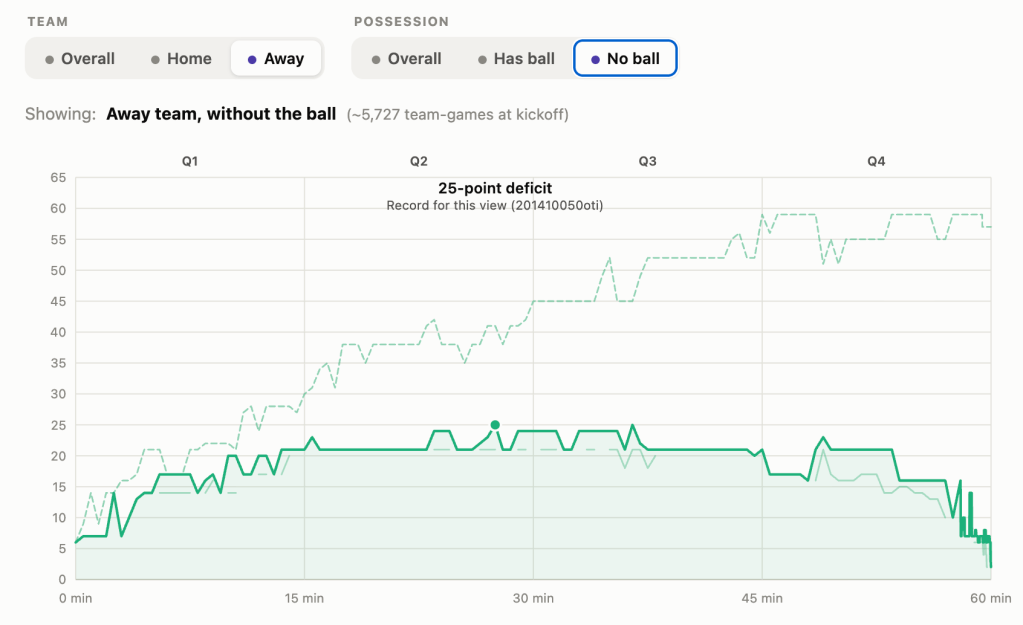
The visualization went through several real iterations. I started by identifying the comeback frontier across all games, then creating separate charts for when the comeback team was the home or away team. Then another set of charts based on if the comeback team had possession at that given time or not.
While for most of the game, 30 second intervals were sufficient, I wanted a second-by-second breakdown for the final two minutes of the game, so included those charts, too. I also wanted to understand the biggest deficit ever in an NFL game (where the team behind couldn’t come back), and added that into the chart.
Finally, once I was happy with the individual charts, I decided to combine them all with simple toggles for the home/away and possession/no-possession conditions, and including the all-time deficit and two-minute charts. (Keen viewers will see that in certain places there are multiple lines on the frontier. I decided that if the frontier line only represented a single game, I wanted to know the next-highest deficit on the frontier and chart that, too.)
After a few styling tweaks, it was ready to ship.
Choosing a name
While building it, I had been referring to it as Win Frontiers, but I was smart enough to recognize that was a crappy name. I asked Claude for help, and it came up with a variety of names, checked them for domain name availability, and I was happy with Comeback Ceiling. It was great to have a thought partner with better taste.
What’s next
At some point I’m hoping to get a live data feed, identify when a game has gone past the Comeback Ceiling, and tweet out to the fans of the team. (And if that team sets a new comeback record, to tweet that out, too!)